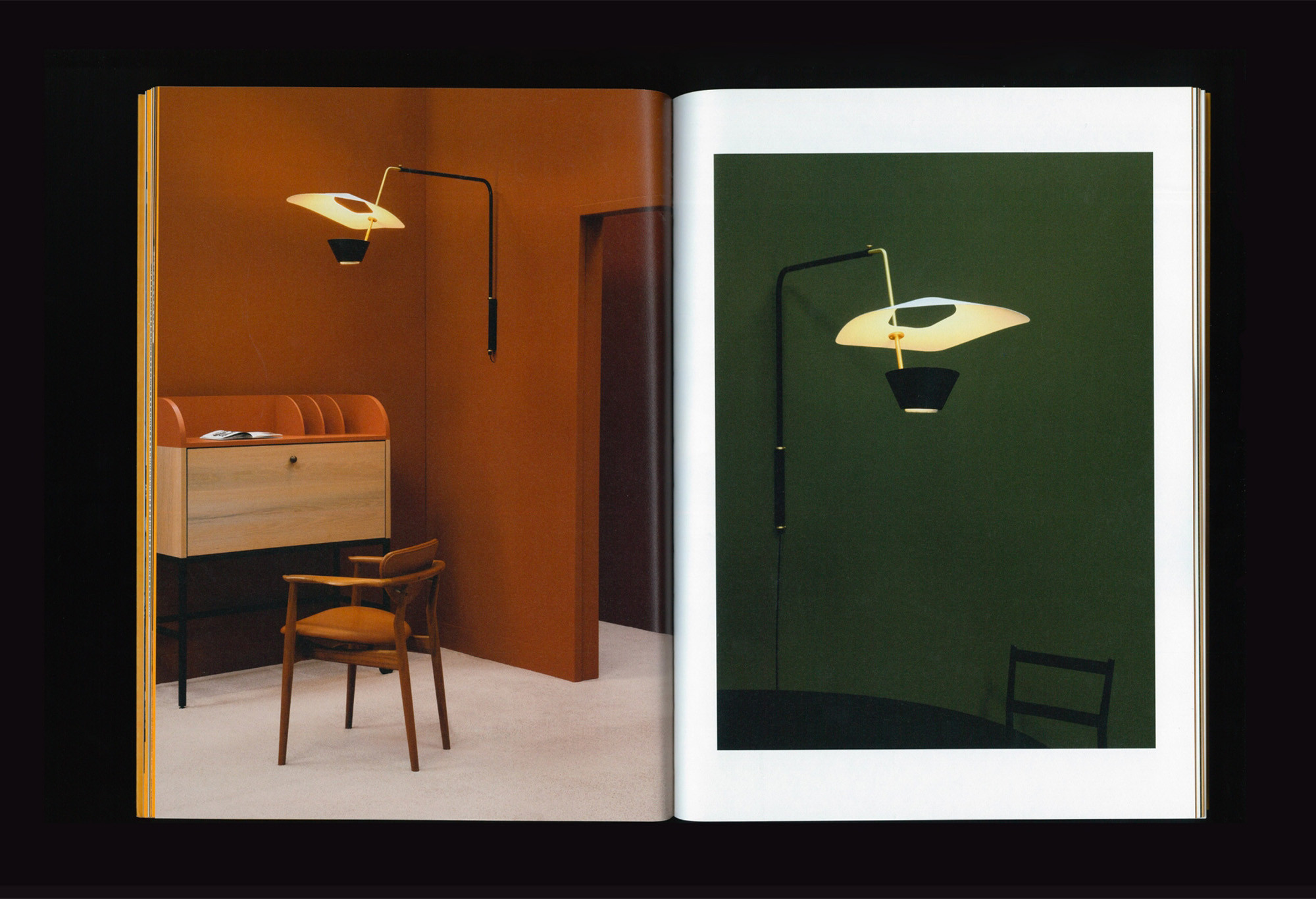
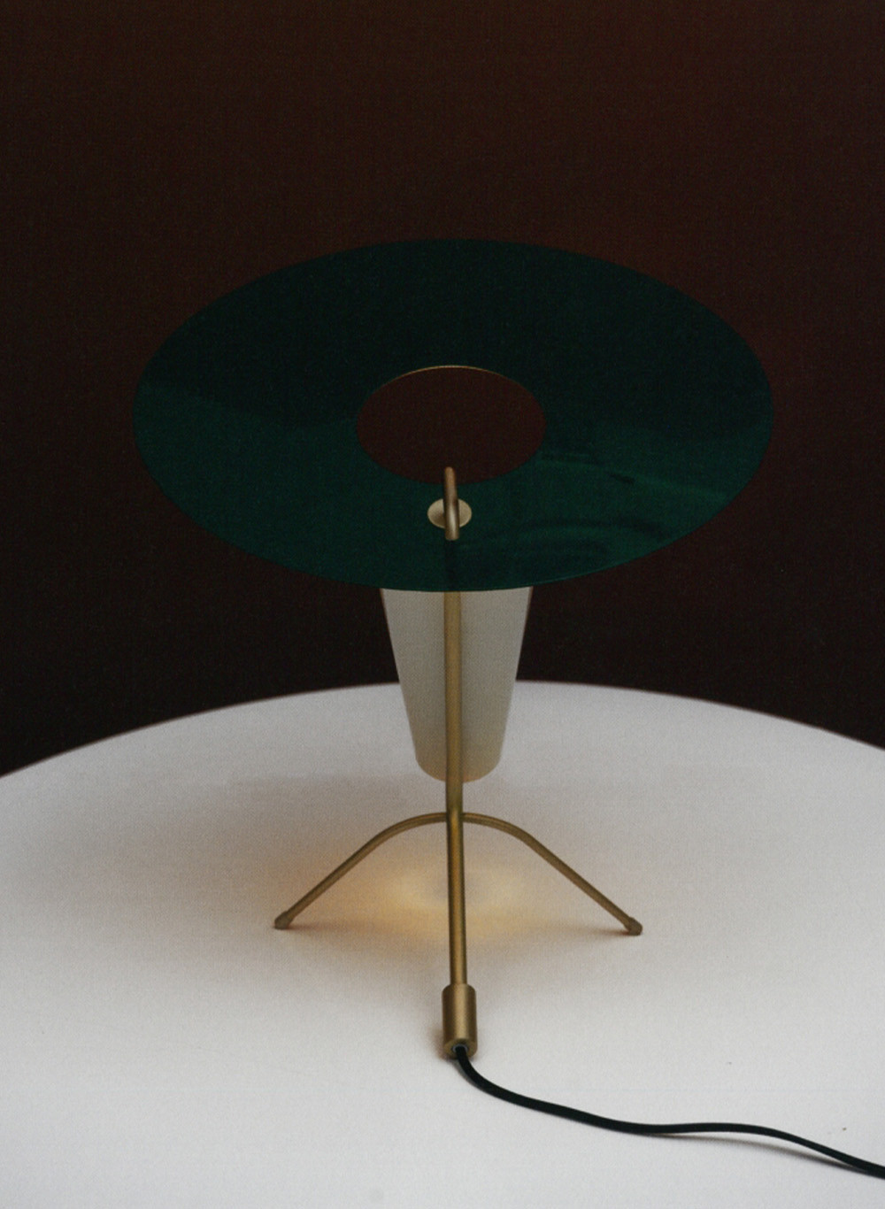
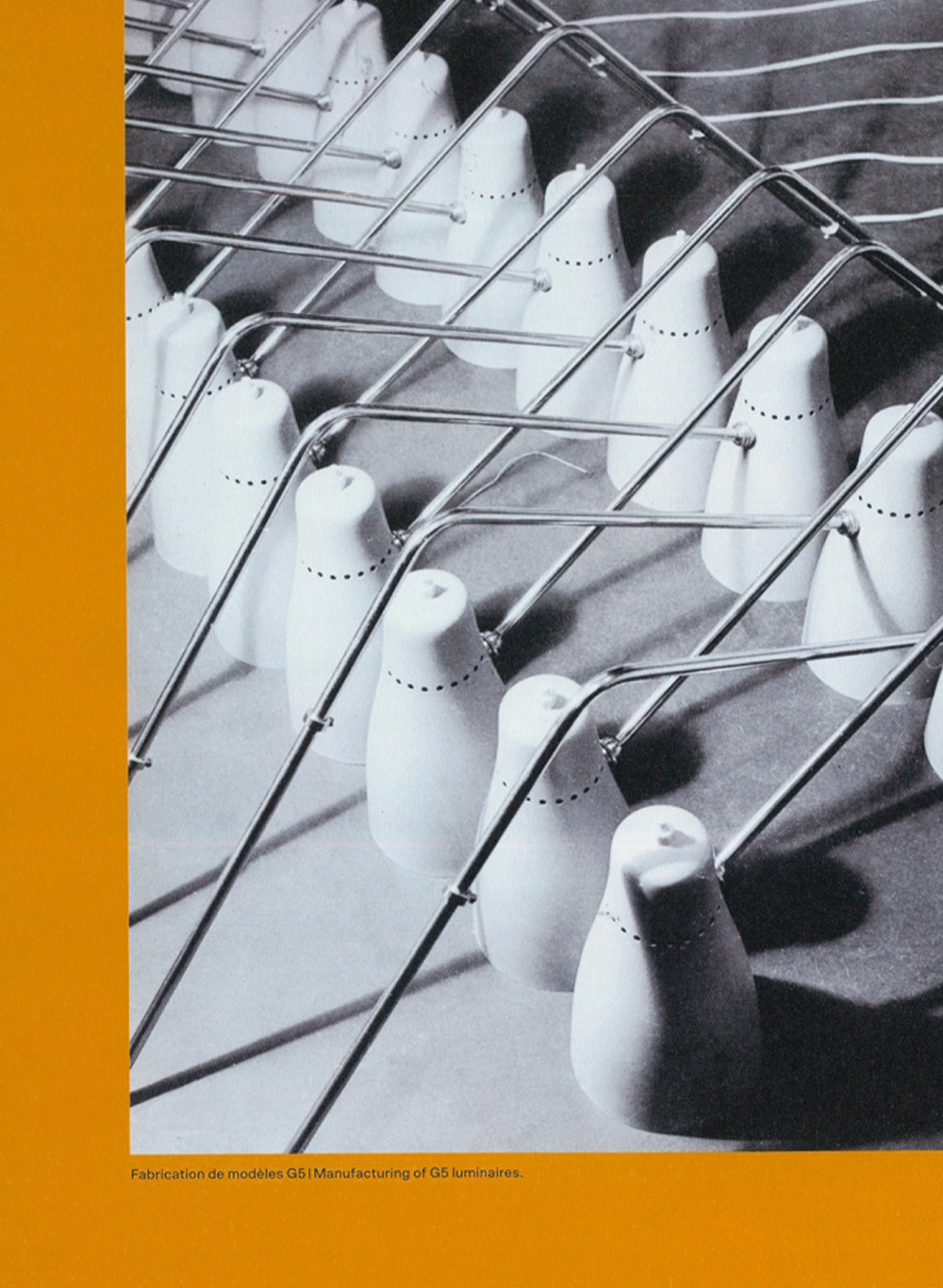
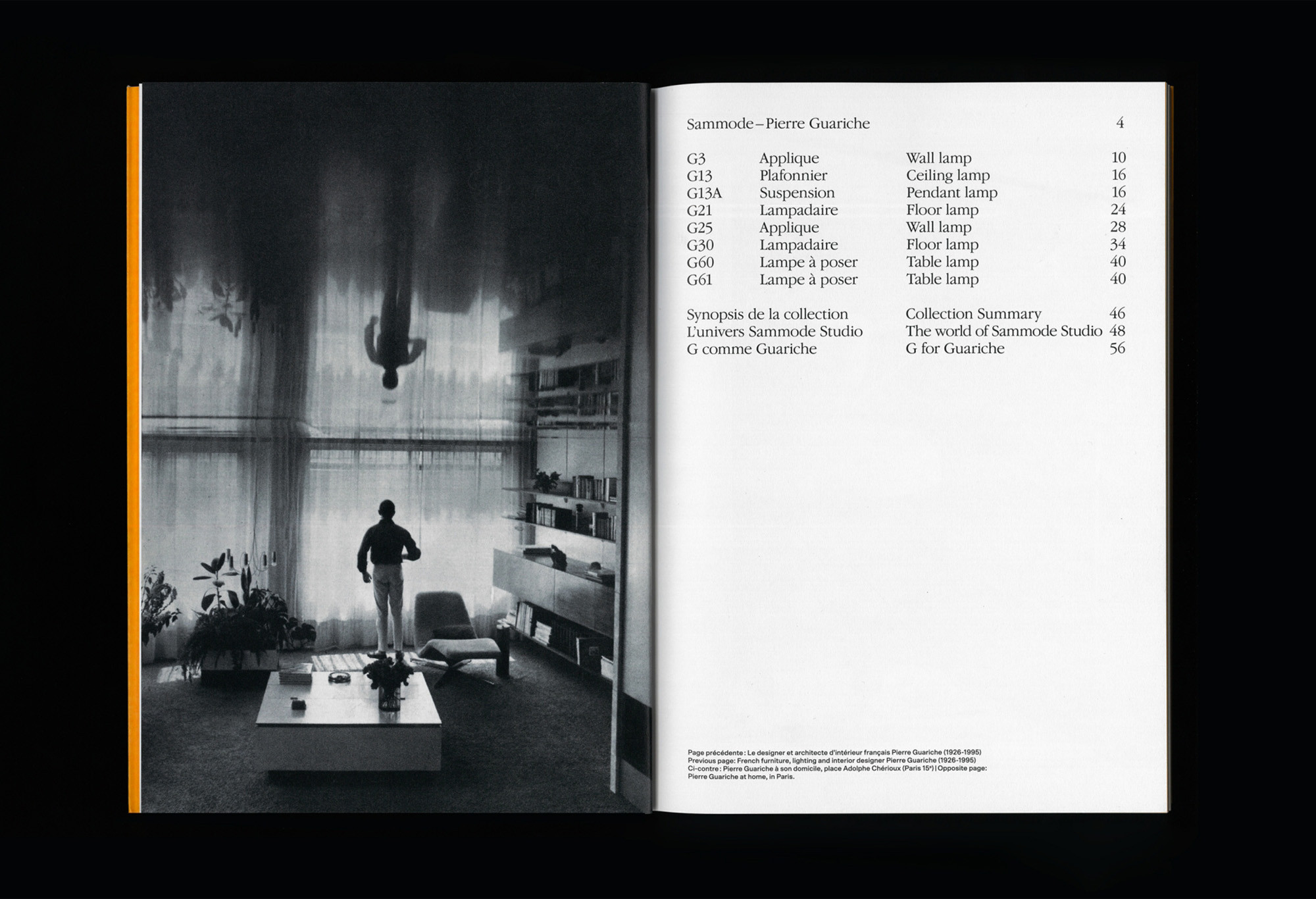
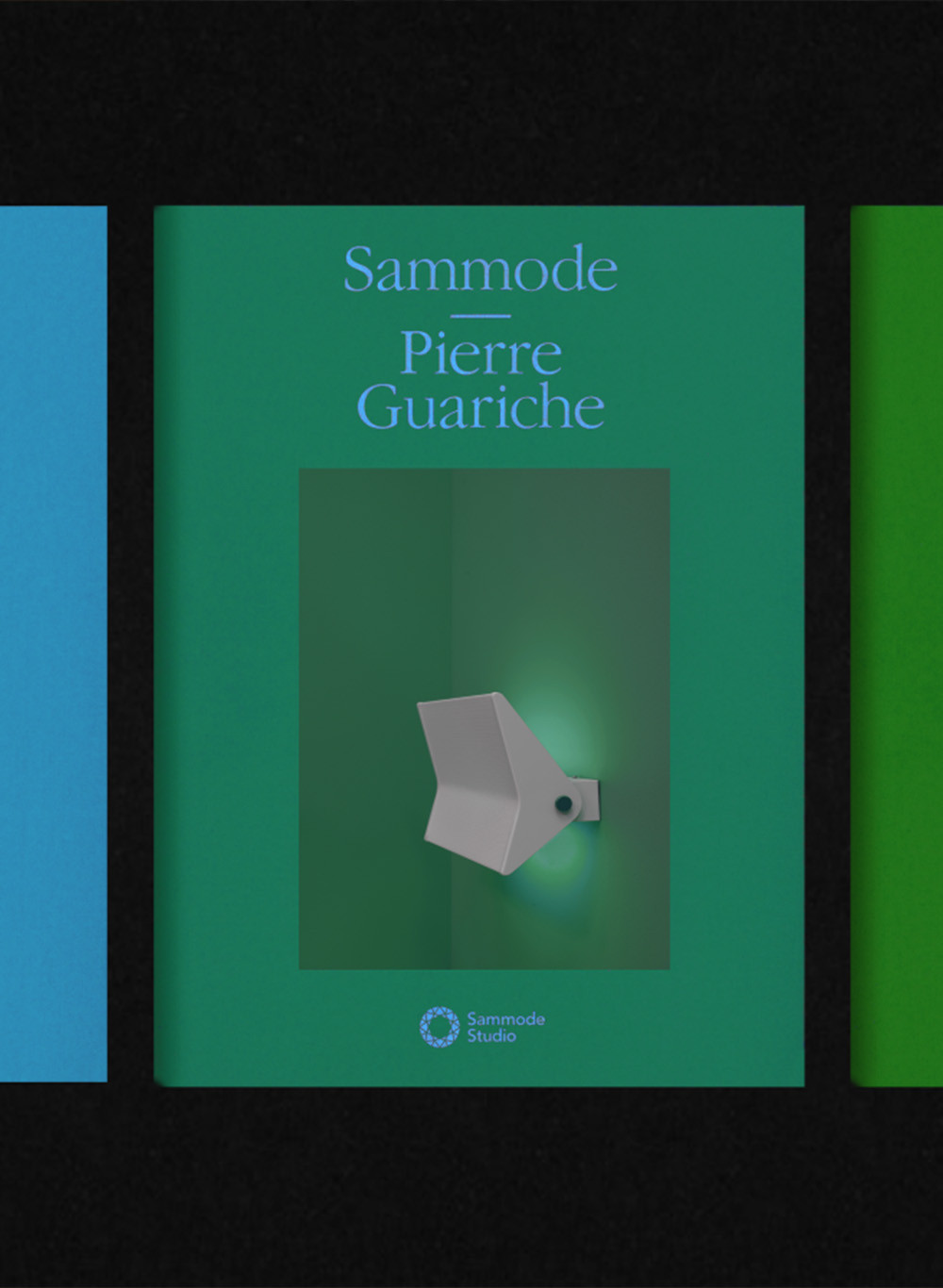
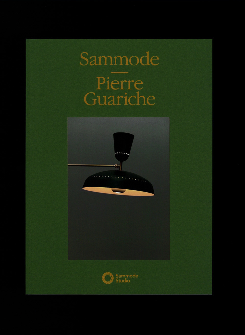
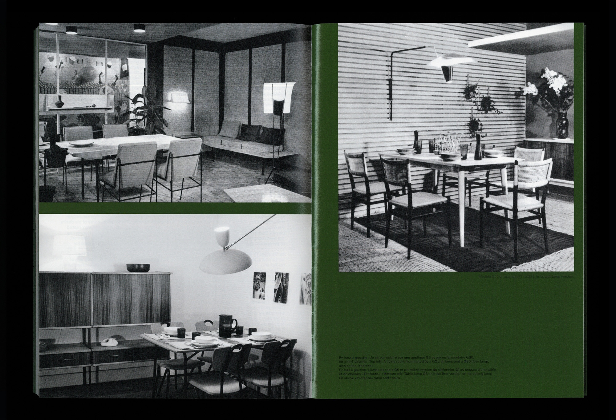
Based on Pierre Guariche’s archives, we designed a typeface to accompany the identity of his lighting collection reissued by Sammode. Materials and colors from the 1960s enrich the communication tools, immersing future clients in the designer’s universe. The whole is complemented by archival images, shedding light on the ways of living of that time.